

Today, as a UK Bank Holiday Special, I've released a major change to the code to give more flexibility to the way you view entries. I'll give you a list and then some screenshots here, but really, you can't appreciate the full glory of it until you play with it 😀
- Improved theme colours in some places
- Adjustments to the Editor to reduce text and increase toolbar space
- Removed aged looking borders around entry cards, giving a fresher look
That's lovely. But that's not the biggie...
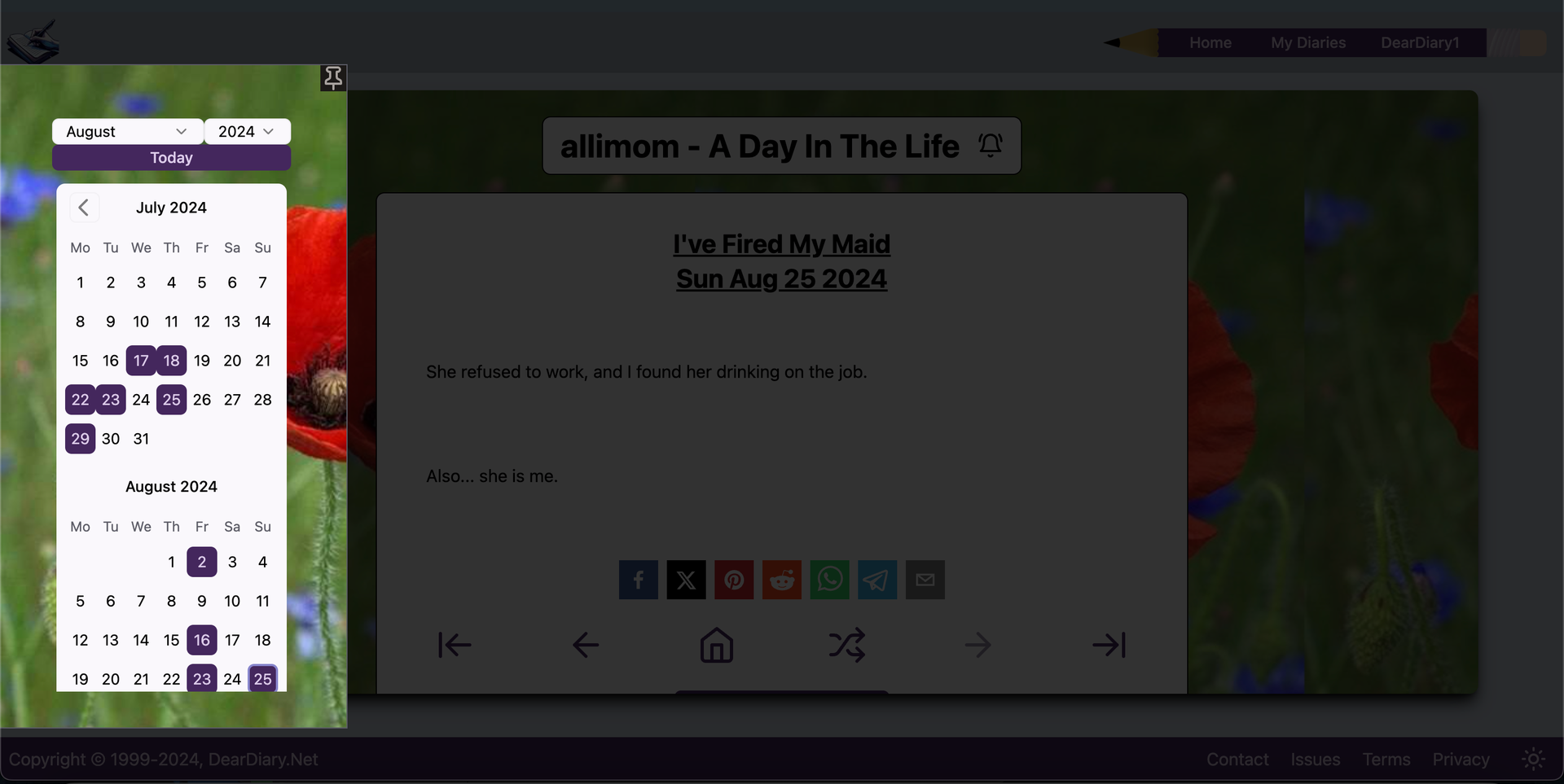
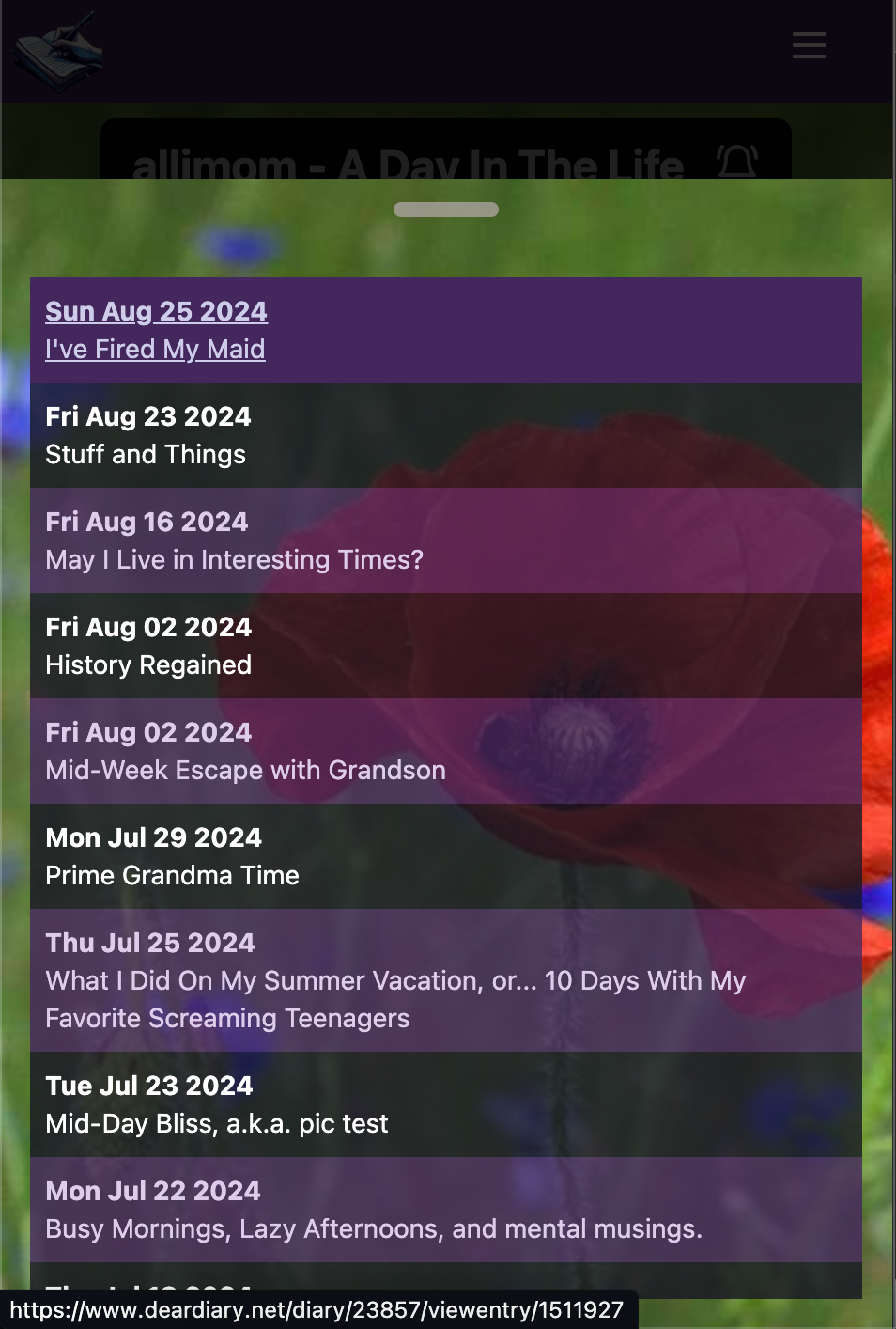
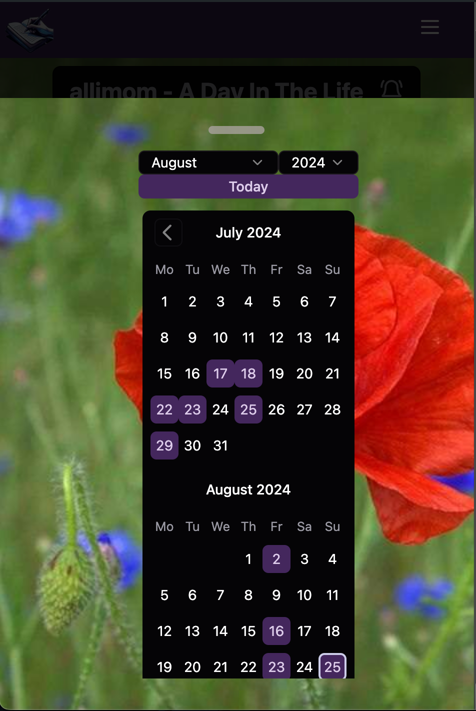
- Entry lists and calendar now, by default, are contained in a little toolbar on the left of the screen. Clicking the relevant icon will pop up either the entry list, or the calendar
- On mobile the toolbar is placed on the bottom of the screen
- This significantly improves mobile usability. If you're wanting to read entries on mobile or tablet this is honestly a total game-changer. It's now actually pleasant to read entries on the mobile.
- If you're on Desktop and still want the entry sidebar - no problem! Popup one of the toolbars, then click the 'pin' icon. It'll remember your choice throughout the site.
- 'Pinning' is not available on mobile (it doesn't make sense)
- 'Pinning' is specific to each browser, not your user account. Again, this is deliberate as different screen sizes may require different pinning settings.
Have a play - tell me what you think 😀
D'Vorah's Diary on the New Look - Entry List Hidden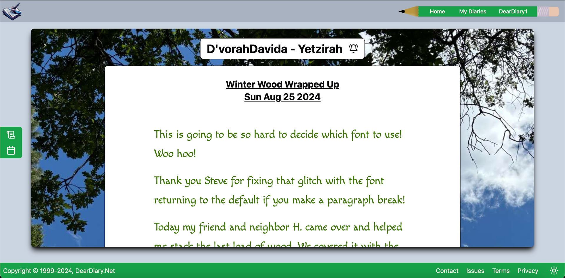
Tim's Diary - With Pinned Entry List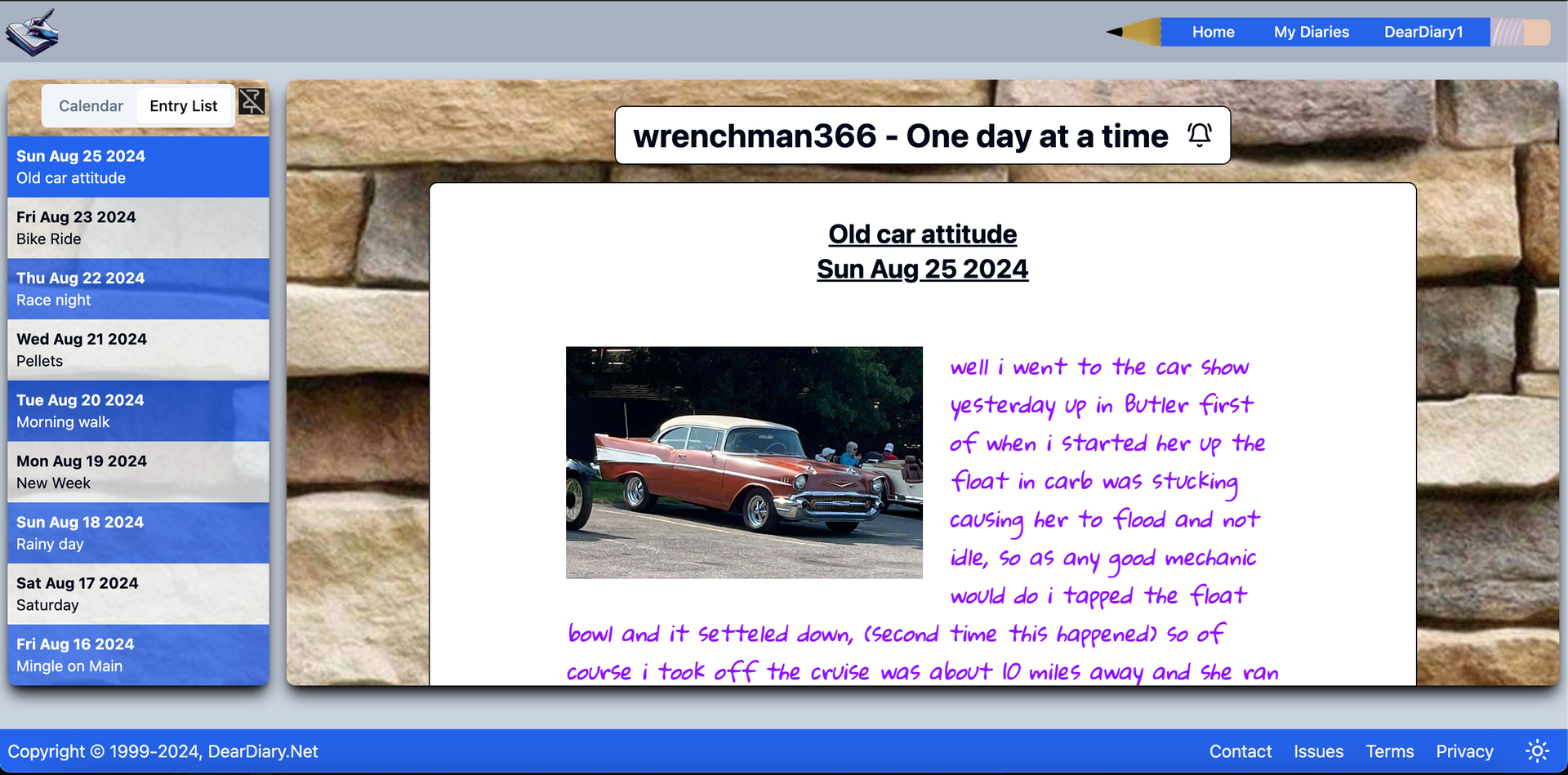
It All Works in Dark Mode too The Calendar Floats In From The Left Side But Mobile Is Where It's At Pop Up The Entry List to Navigate Or Popup The Calendar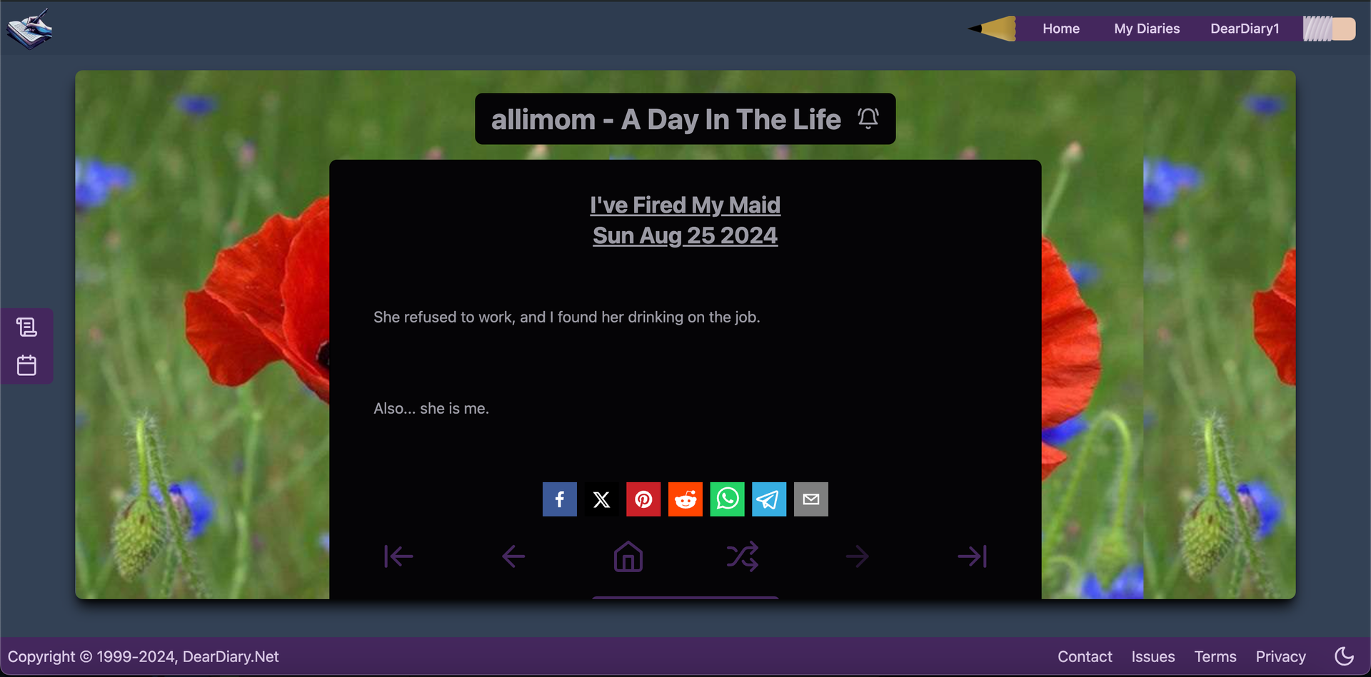
Did you make it down here? Hahaha - Good on you.
Let me know your thoughts!